Overview
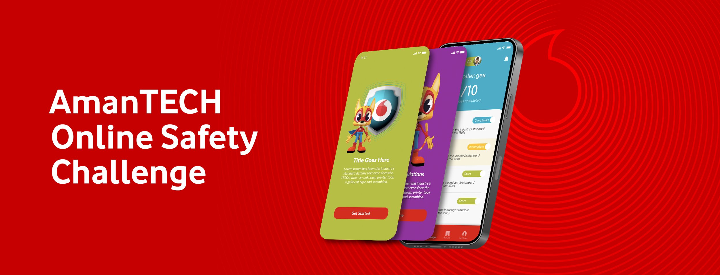
Developed mobile screen UI samples for the AmanTECH Online Safety Challenge, a Vodafone initiative aimed at educating children and parents about online safety. The project involved creating distinct interfaces for two user groups: parents and children.
The designs emphasize a user-friendly and engaging experience tailored to the needs of both audiences, showcasing the potential look and feel of the app to the client.
UX/UI Approach
Distinct User Journeys for Parents and Children
The AmanTECH Online Safety Challenge app features two unique logins, each designed with its audience in mind, providing an engaging and educational experience for both parents and children.
Parents’ Interface
Straightforward Onboarding: The onboarding screens for parents are designed with simplicity and clarity. The screens guide parents through the key features and benefits of the app with straightforward messaging and visuals.
Informative Guide Page: I designed a clean and organized guide page for parents, providing valuable insights and resources about online safety. The layout ensures easy navigation and access to important information, while utilizing Vodafone's red color to maintain brand consistency and reinforce visual identity.
Children’s Interface
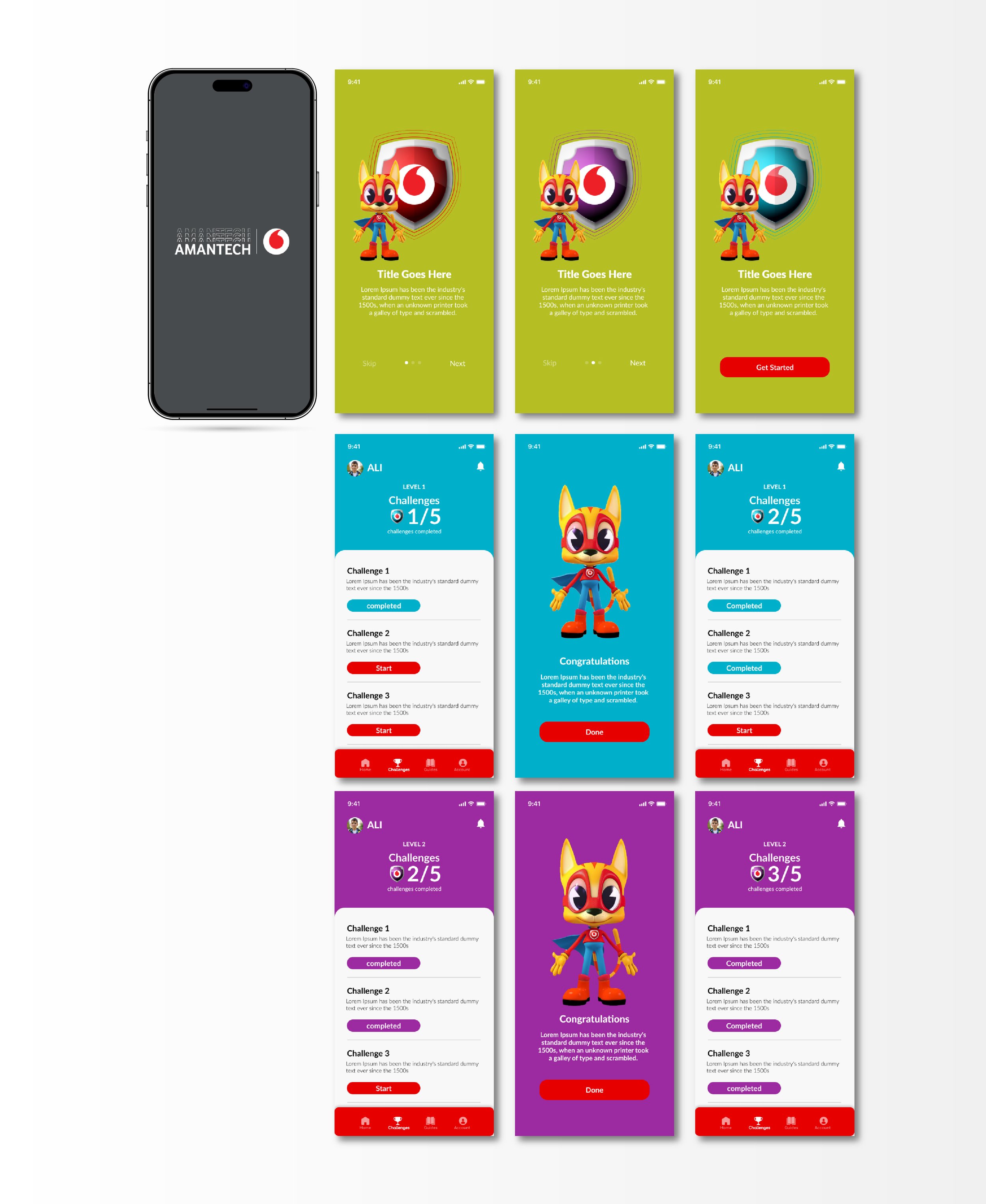
Colorful Onboarding with Character Introduction: The onboarding experience for children is vibrant and playful, using Vodafone’s secondary color palette. It introduces a friendly character to guide children through the app, making the experience fun and engaging. The colorful visuals and interactive elements are designed to capture the attention of young users.
Interactive Challenges: For the children’s section, I focused on the look and feel of the challenge screens. These screens are designed to be interactive and engaging, encouraging children to complete online safety challenges. The interface includes dynamic buttons that change upon completing a challenge, leading to a congratulatory page that celebrates their achievement with fun animations and positive reinforcement.


