Overview
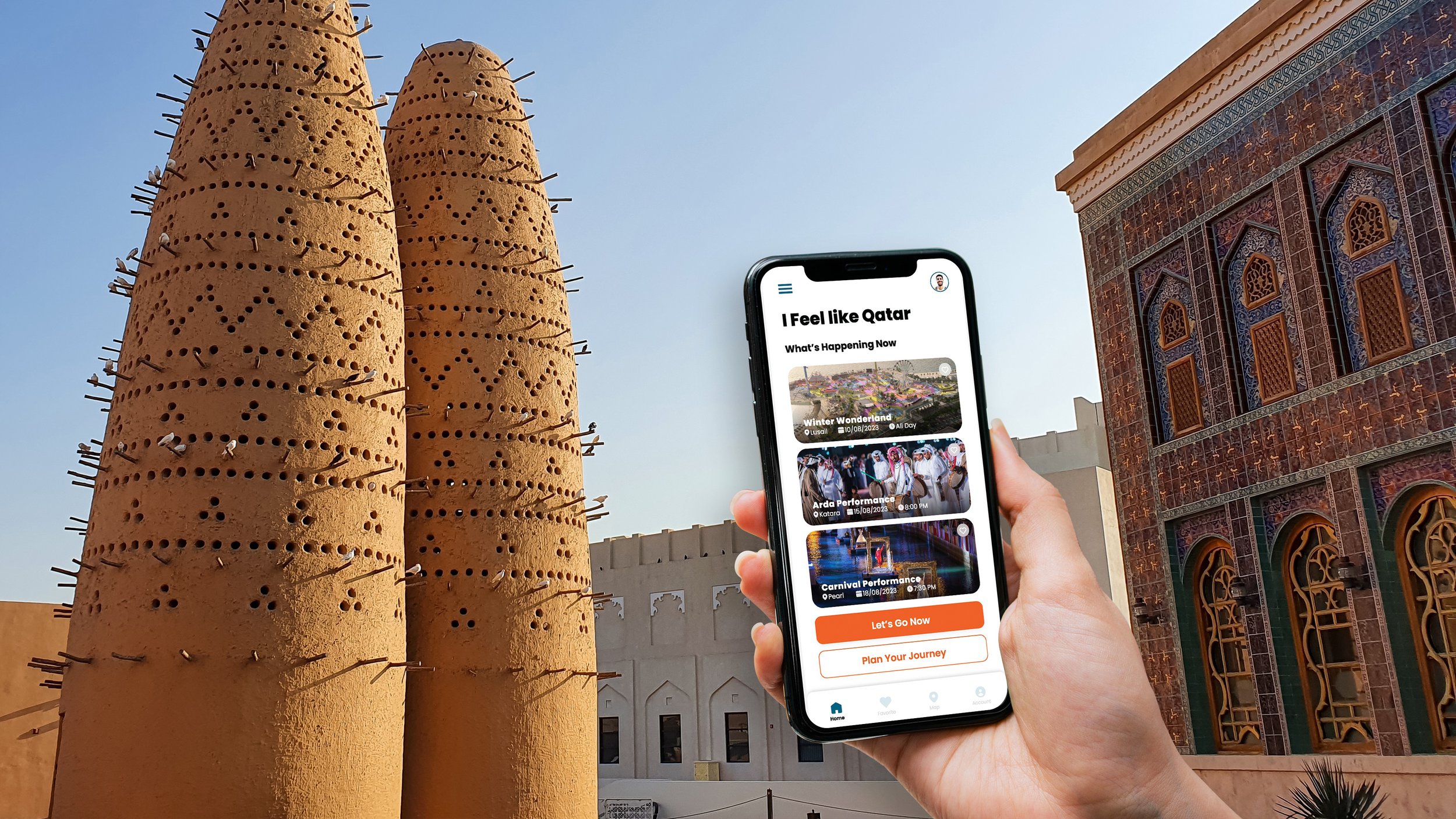
The "Visit Qatar" mobile app is an existing platform that serves as an indispensable guide for exploring the city, providing users with up-to-date information on the latest attractions, events, and festivals in Qatar. In this project, my role was to revamp the app's visual appeal and user experience, aiming to create a more engaging and intuitive interface.
UX/UI Approach
Partial UI Implementation
The UI redesign was implemented selectively, focusing on specific screens that demonstrated the updated look and feel, as well as the content integration for a newly added category “I Feel like Qatar”
New Category Addition - "I Feel Like Qatar"
Collaborating with the strategy team, we identified the need for a new category in the main navigation system. This addition, named "I Feel Like Qatar," served as a call to action for spontaneous visitors, particularly those from Saudi Arabia and the Gulf region. The aim was to cater to individuals who might impulsively choose Qatar as a weekend getaway destination.
Enhanced Visual Identity
The primary focus was on revamping the app's visual elements to create a more modern and appealing aesthetic. This involved incorporating larger, bolder fonts to improve readability and elevate the overall look and feel.
Color Palette Refinement
The distinctive orange and blue colors, representing the brand, were accentuated to make them more prominent within the app's interface. By strategically implementing these colors, we ensured a cohesive and visually striking user experience.
Elegance in Design
While enhancing the visual aspects, it was crucial to maintain an elegant interface. This balance between boldness and elegance was meticulously curated to offer a seamless and visually pleasing interaction for users.

